Visual identity for an international company that specializes in the development and management of touristic towns and hotels.
PROJECT INFO
CHALLENGE
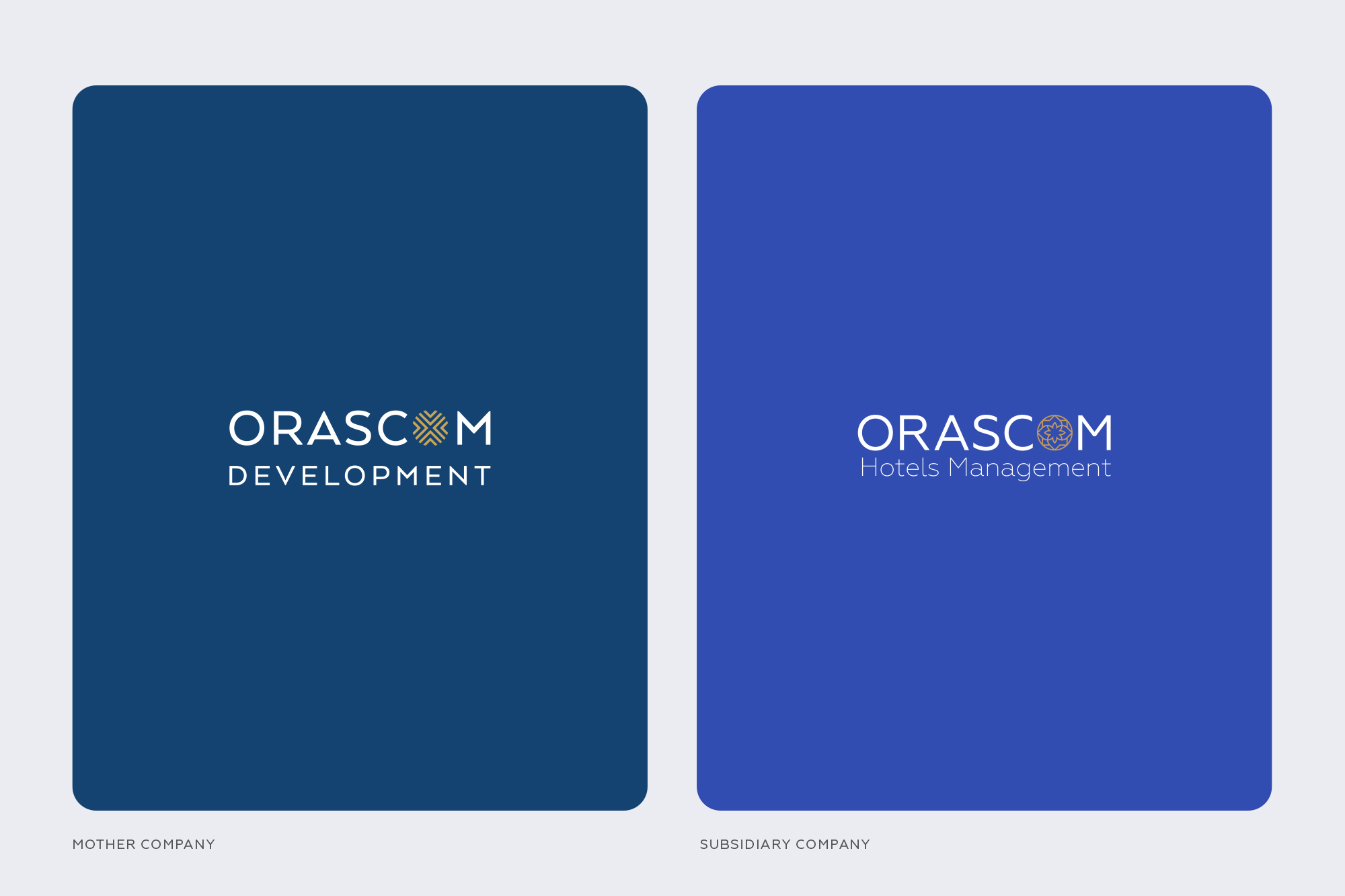
Orascom Hotels Management (OHM) is a subsidiary company of Orascom Development Holding (ODH) one of the largest development company in the world. OHM’s is portfolio consists of 35 operating Hotels across 4 countries.
To create a visual identity for the new subsidiary of this international company, well-known for its development and management of vacation resort towns and hotels. Once OHM was established as a separate entity, the race was on to build a friendly, welcoming, yet recognizable new logo to distinctly represent the customer experience of destinations and hotels. The logo design challenge was therefore to preserve a clear visual linkage with the ODH logo but also uniquely representing OHM with a warmer, lighter, more engaging logo and design approach to excite the target audience of modern travelers.
The global target audience is intentional in their travel choices, sophisticated and cosmopolitan, and expects a high level of modern service and comfort. They are looking for and drawn to new experiences rather than simply a holiday.
SOLUTION
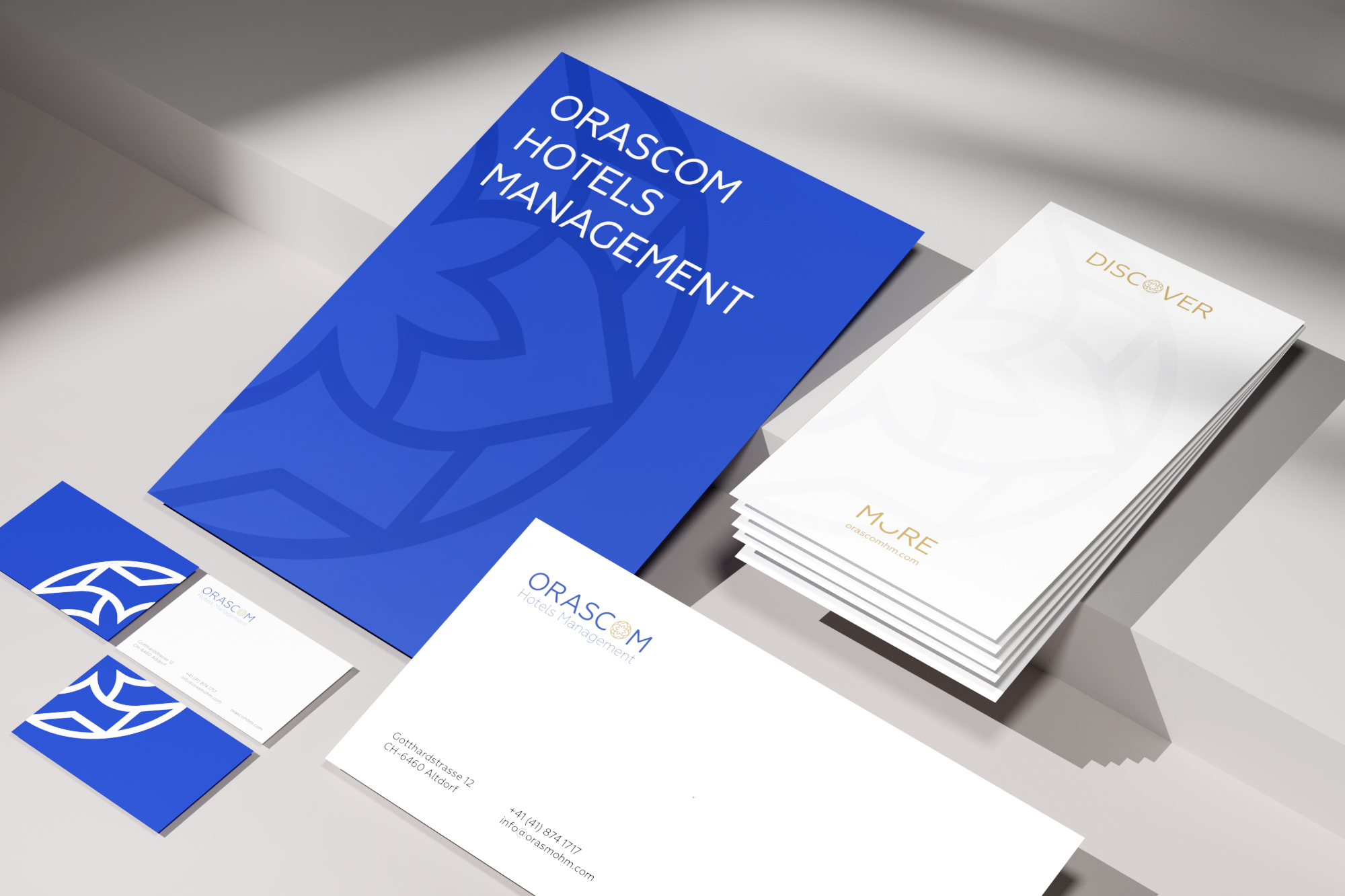
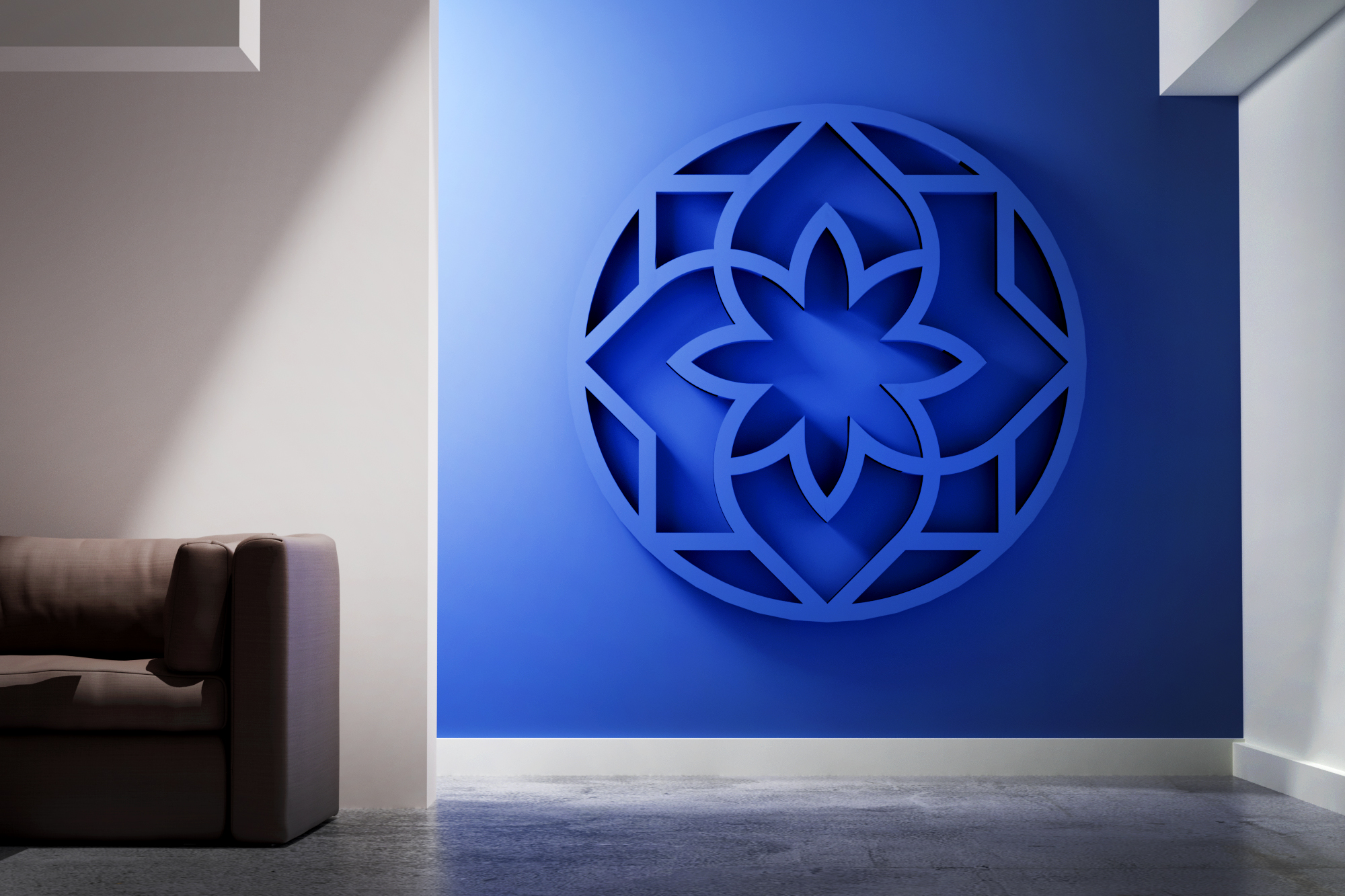
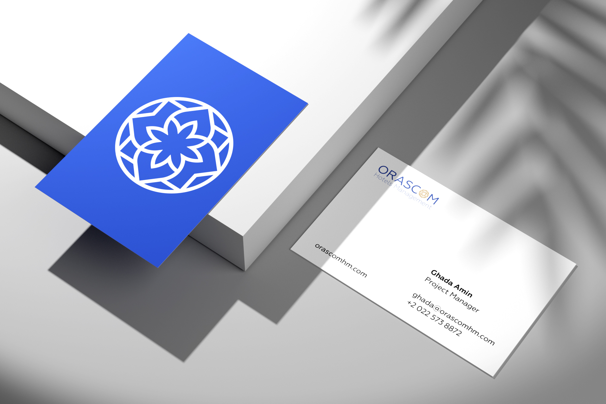
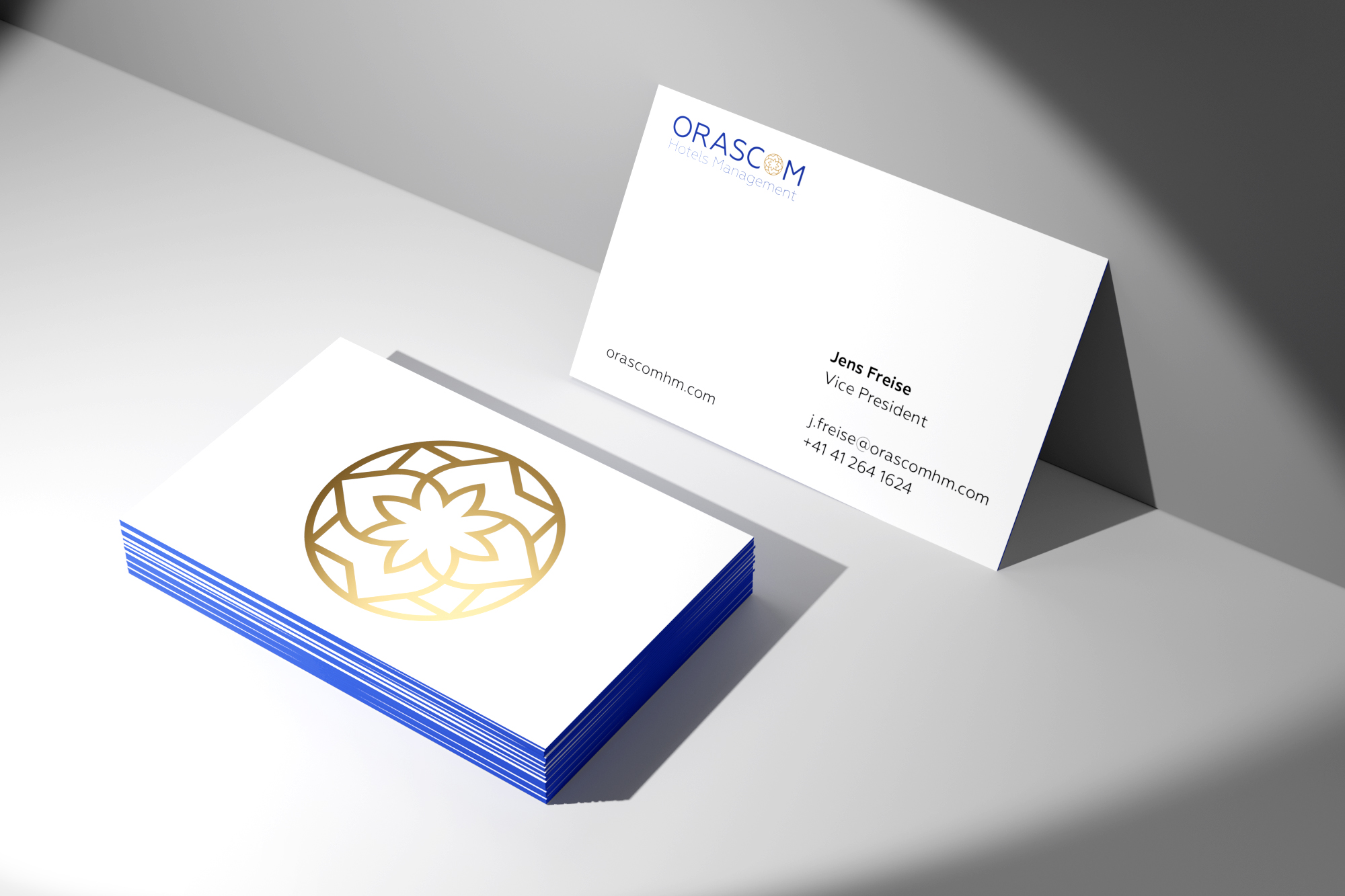
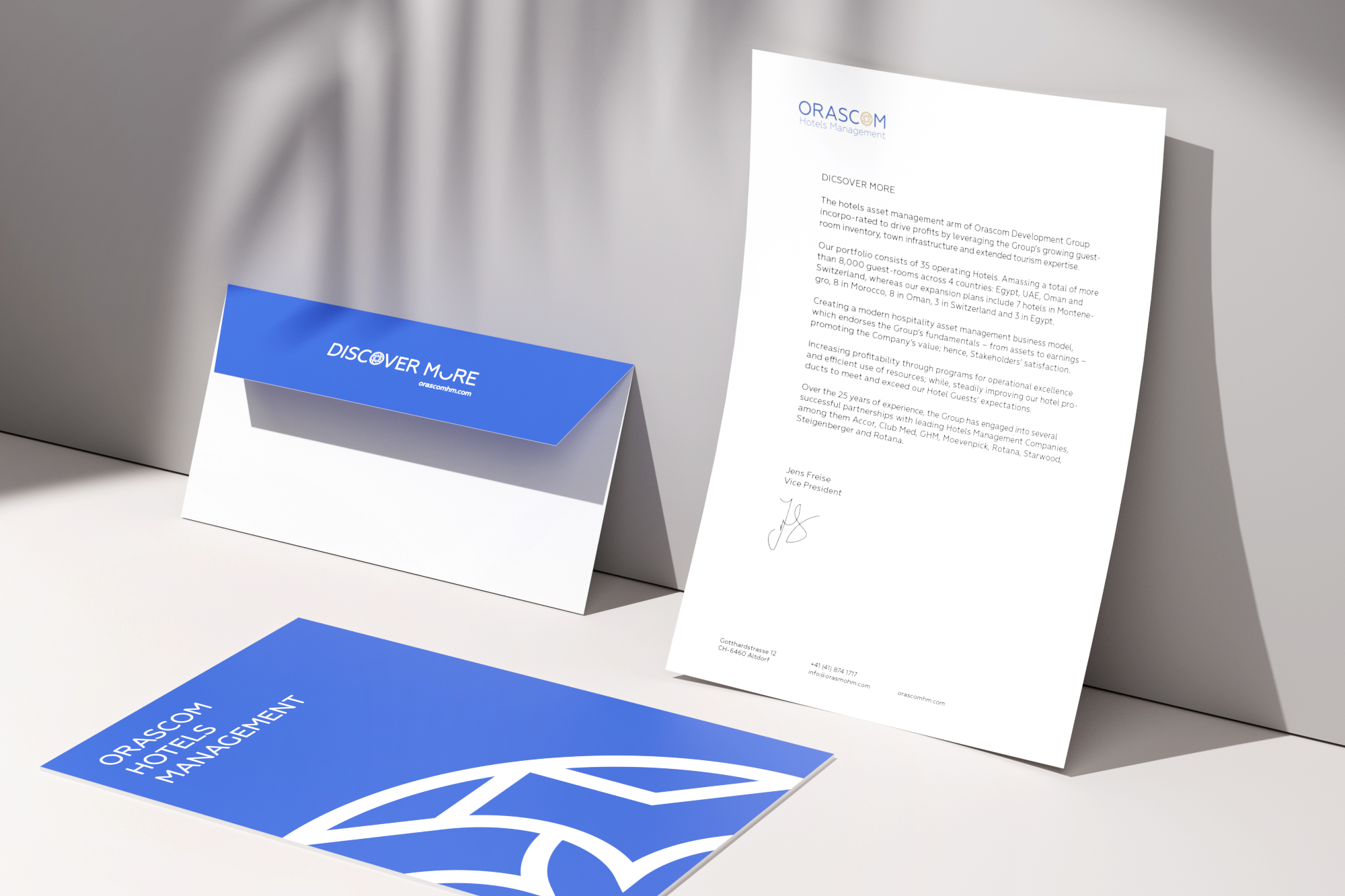
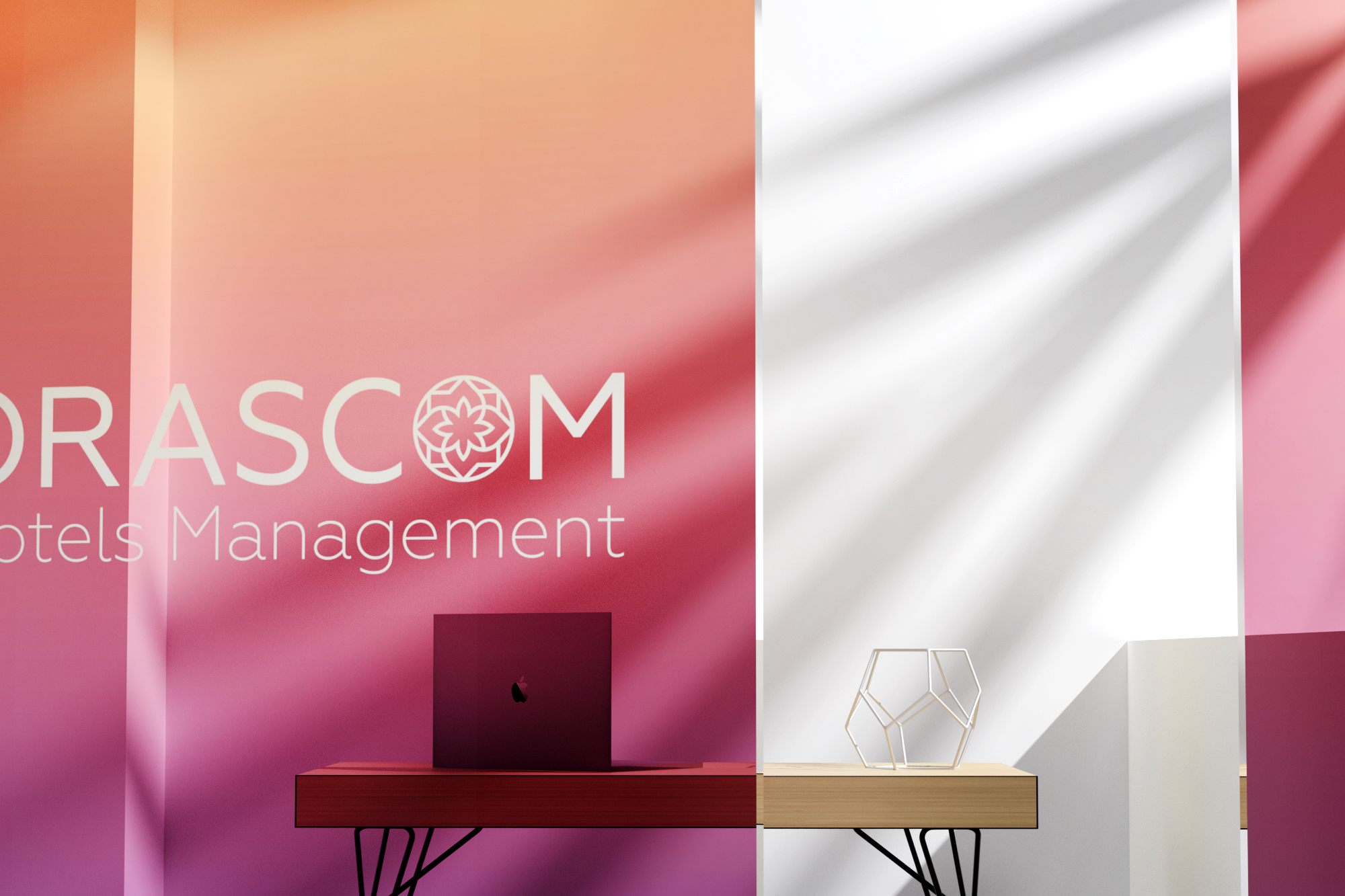
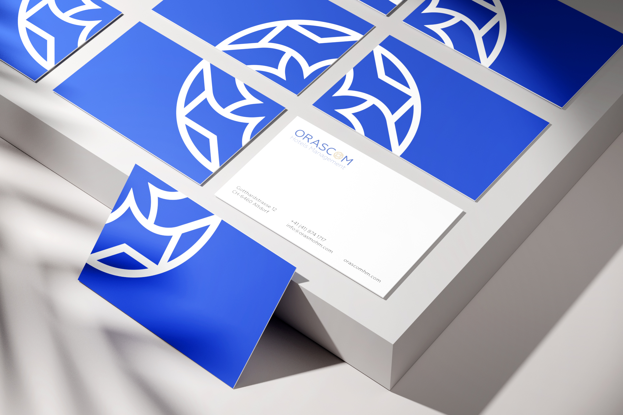
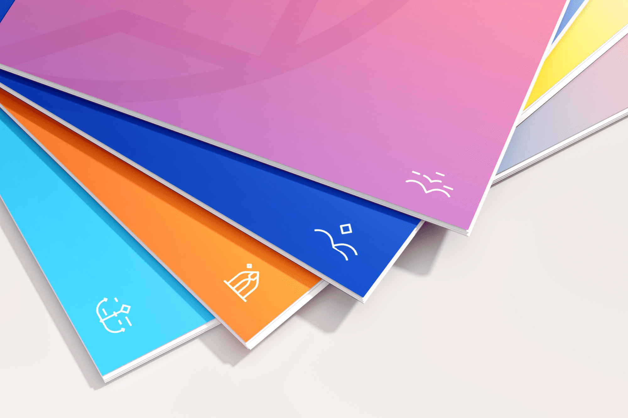
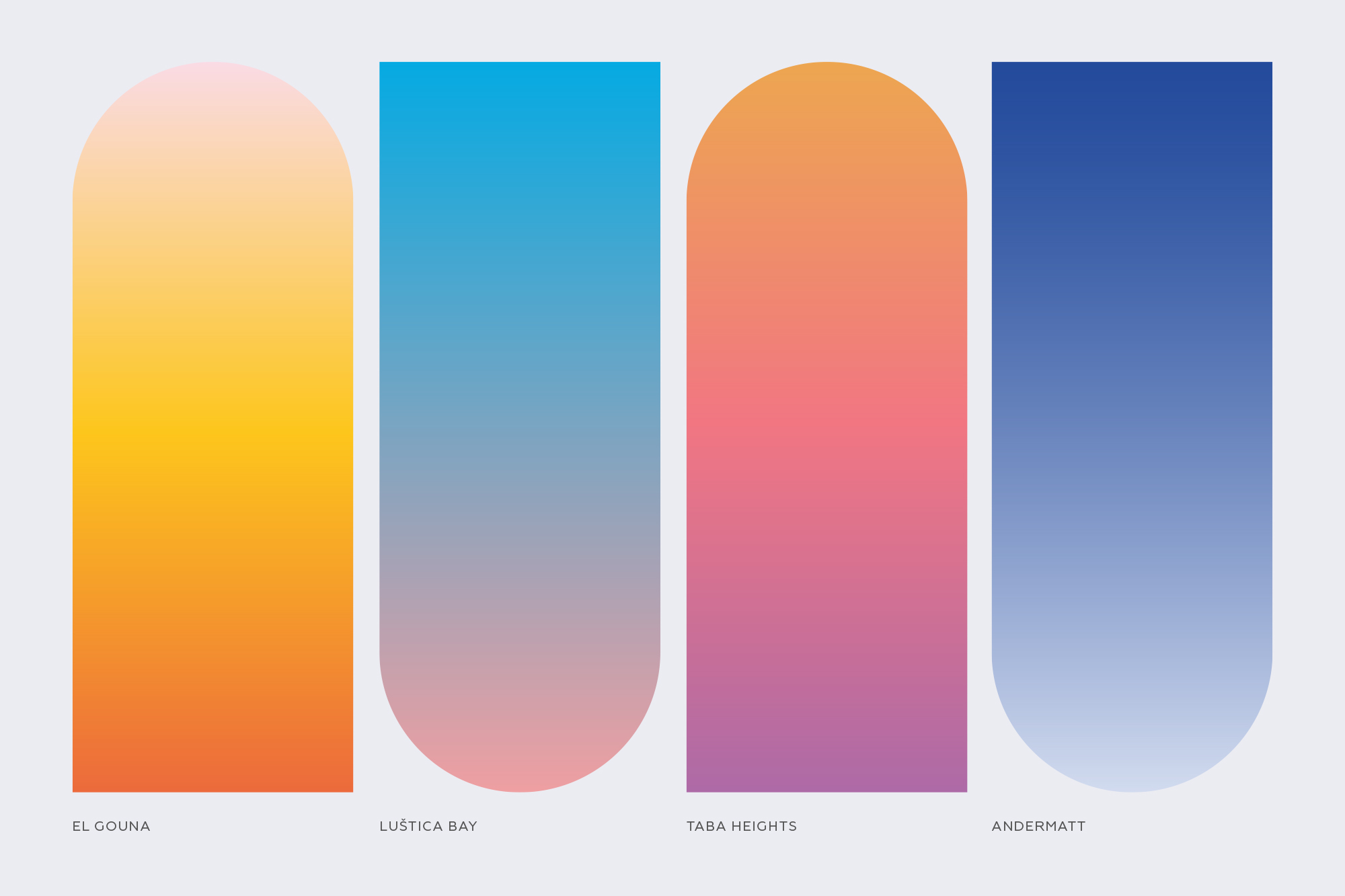
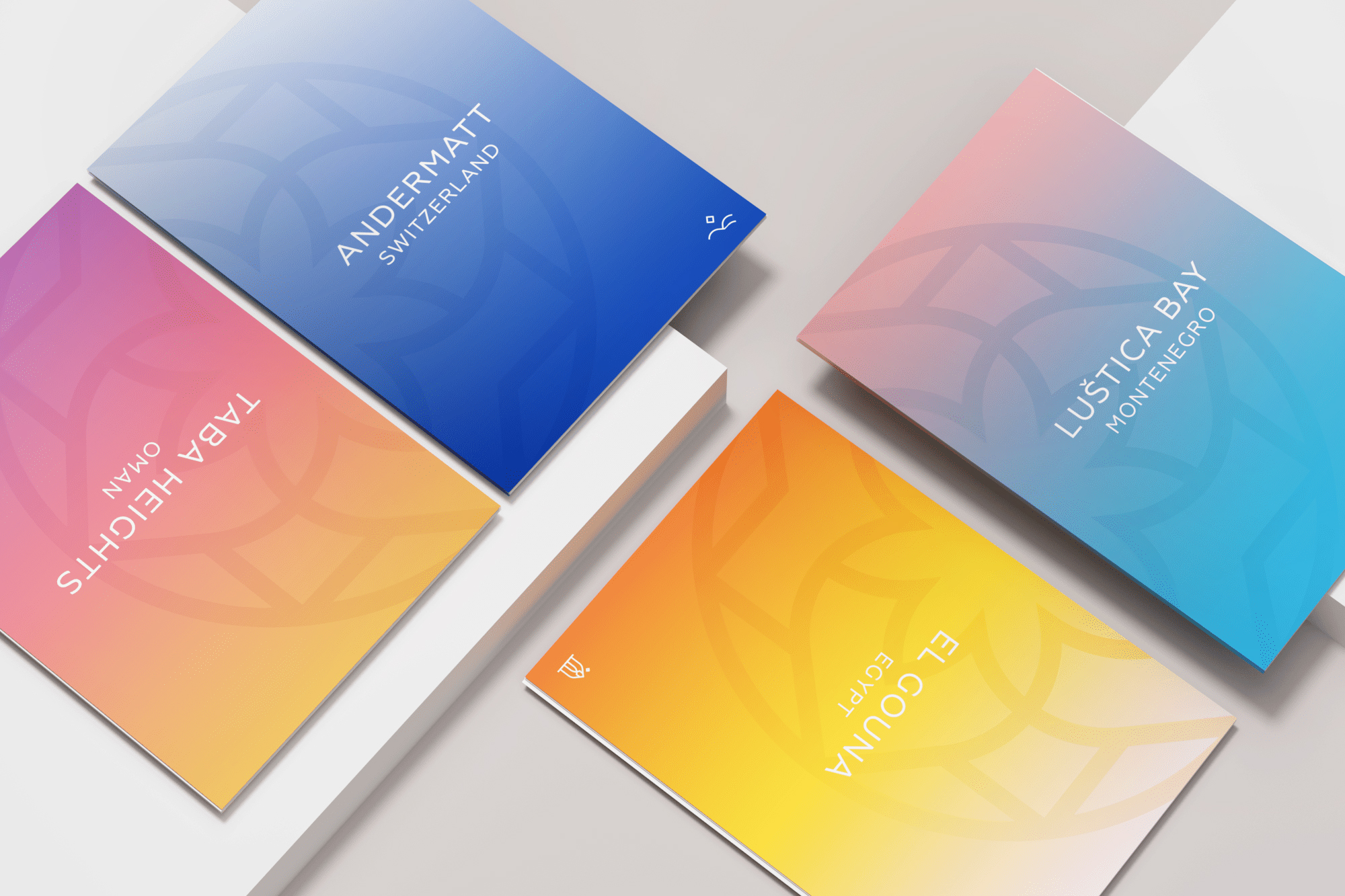
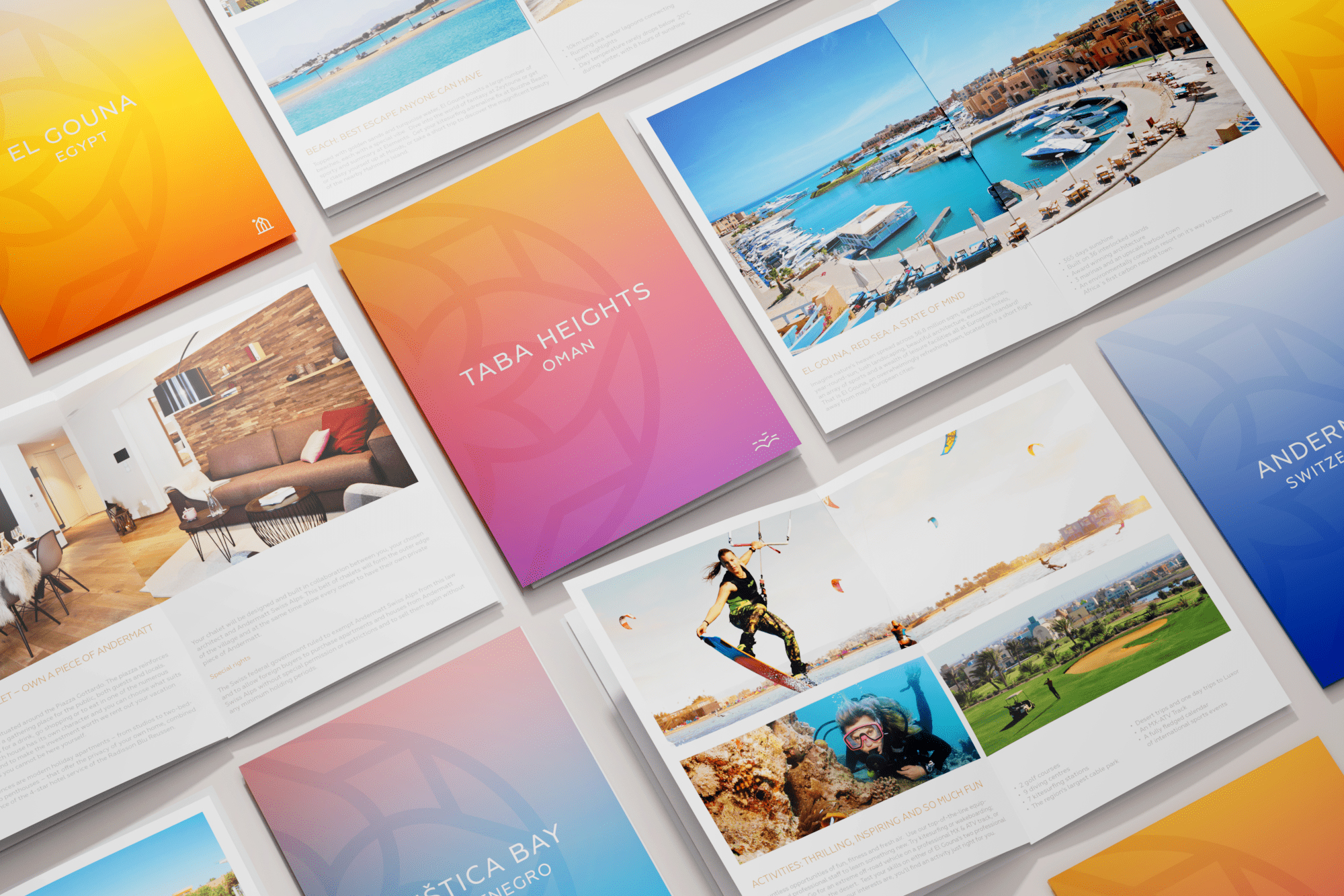
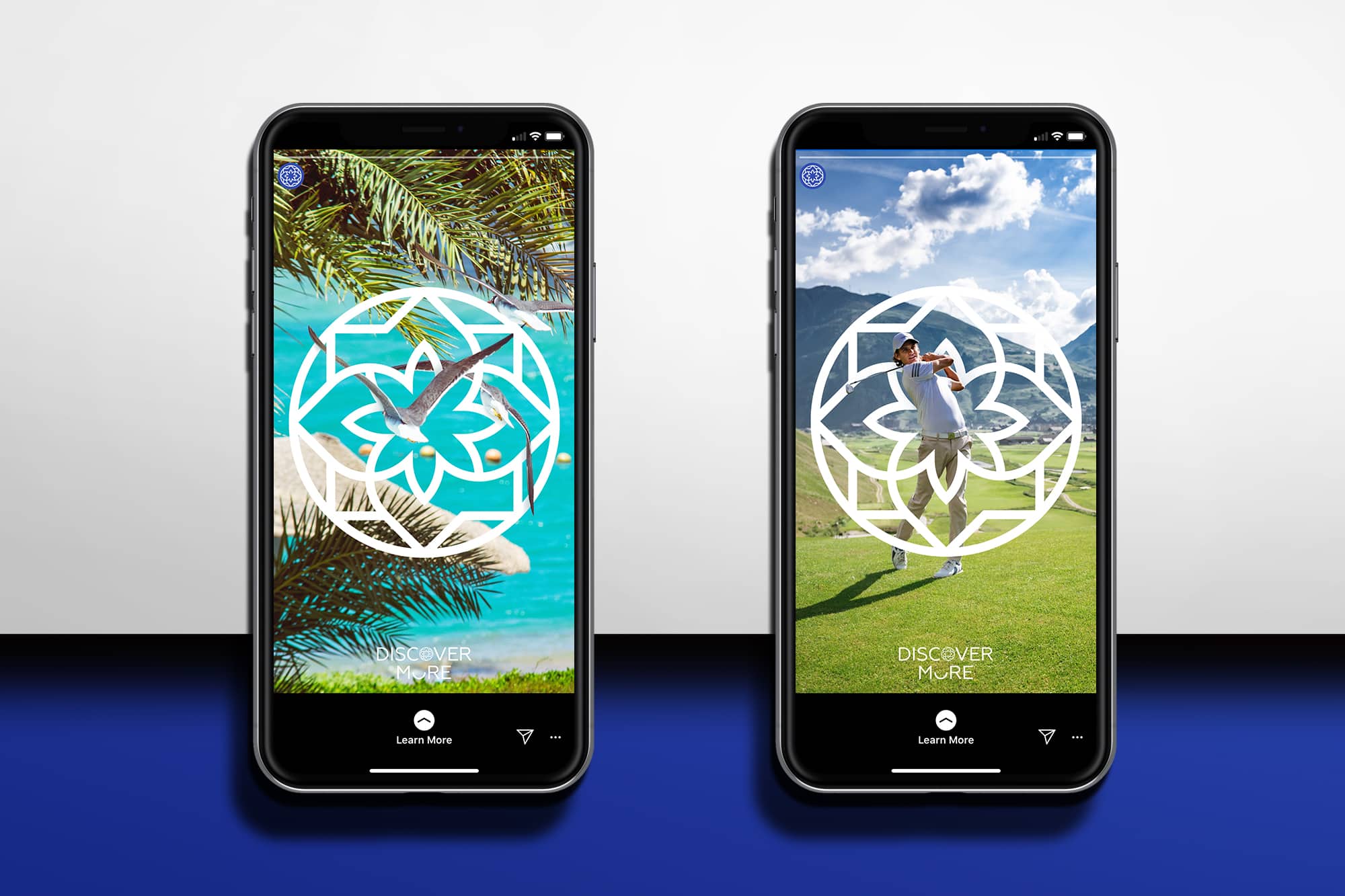
Moving away from the darker hued tones of the ODH logo, into a lighter, brighter new OHM color palette which is more expressive, open, and designed for international appeal. The icon is a stylized flower that suggests the Middle-Eastern heritage of the brand and also hints at a compass, the age-old tool for world travelers. This clean, classic, and contemporary approach achieves a vibrant and fresh feeling in color, typography, and photography, which extends to the collaterals, digital application, and advertising campaign.
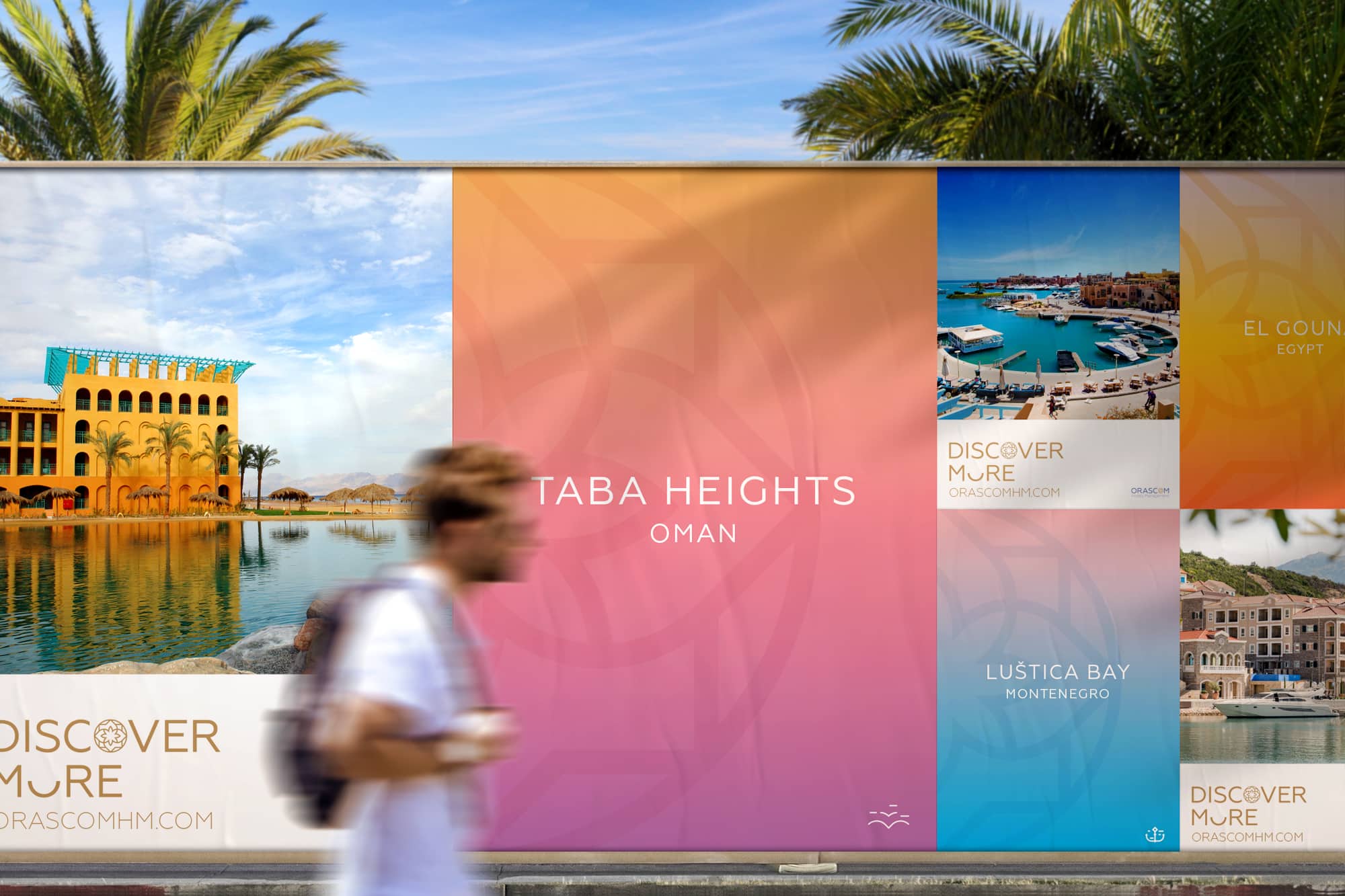
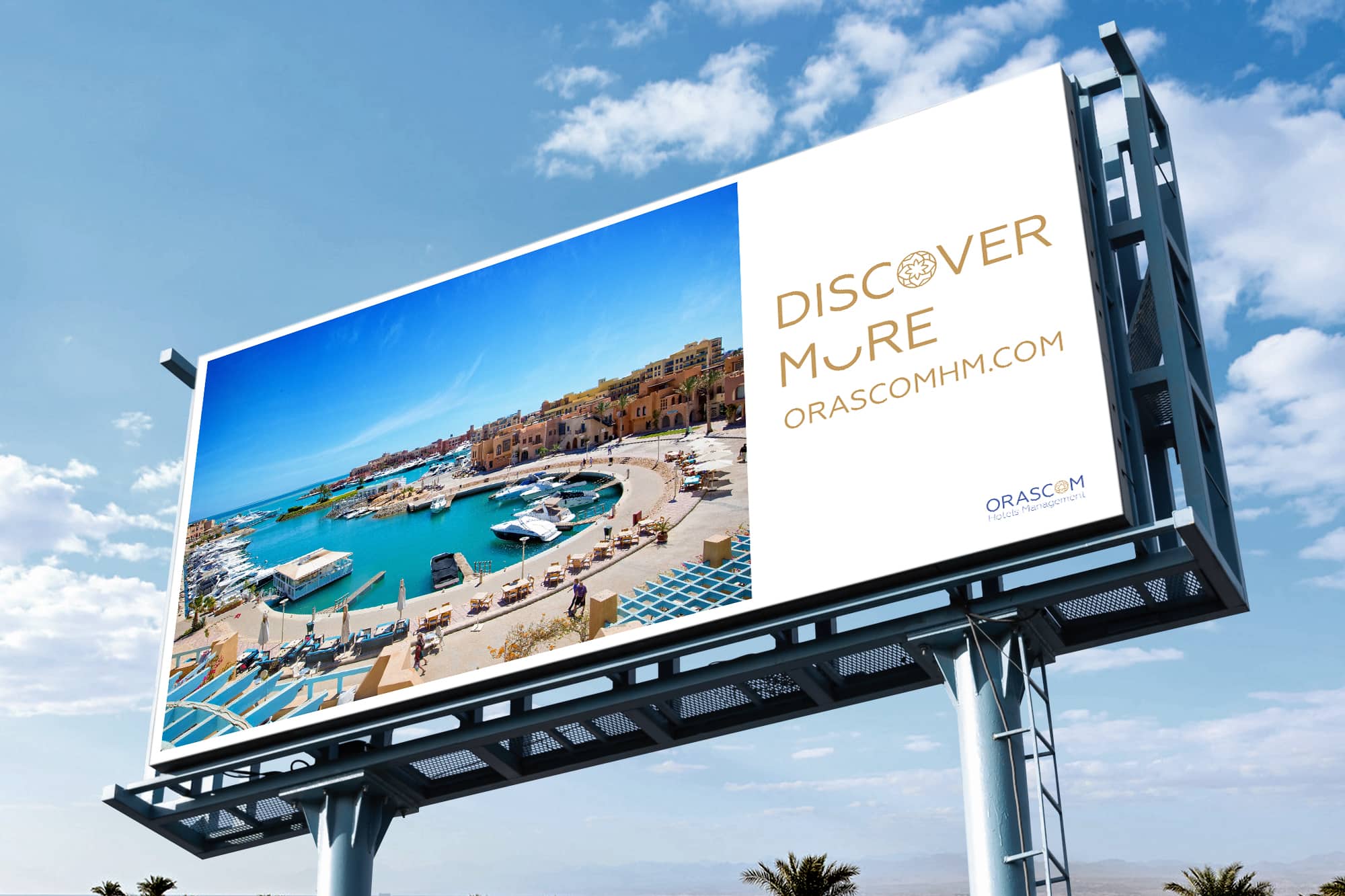
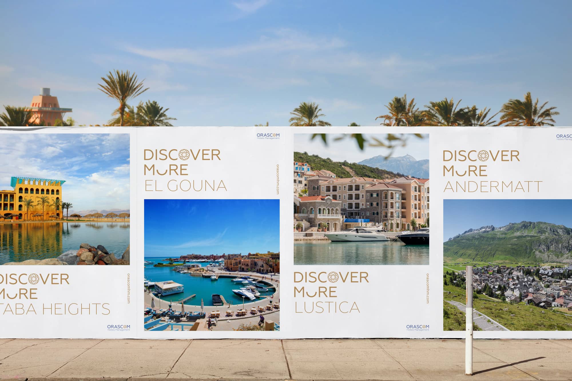
For the destination booklet and advertising campaign, a consistent brand architecture uses the core visual elements of the new OHM identity. To reinforce excitement, bright gradients offer an impressionistic essence of each destination for travelers who want to feel drawn to the destination and where “discover more” is their motto.
THE RESULT
The new OHM branding strategy, design, and artwork seek to propel the company into the future and grow its unique identity, yet still recognizably aligned with the parent company. The effectiveness of this new approach succeeded in raising the value of the brand and brand recognition as seen in greater customer loyalty and engagement, as well as revenue growth.
WHAT I DID
Logo Identity Brand strategy Environments Digital Advertising Campaign