Logo and illustrations for the Moscow-based bar full of young and careless spirit.
PROJECT INFO
CHALLENGE
Moscow’s bar landscape is rapidly evolving and filled with new players. That rangers from classic pubs to artsy pop-up bars. What does a bar full of young spirit would look like where are no rules, no stiffness, no prejudice? A bar that is ruled by a simple idea of piercing ruthless youth. Where people are united by one simple idea of having fun.
SOLUTION
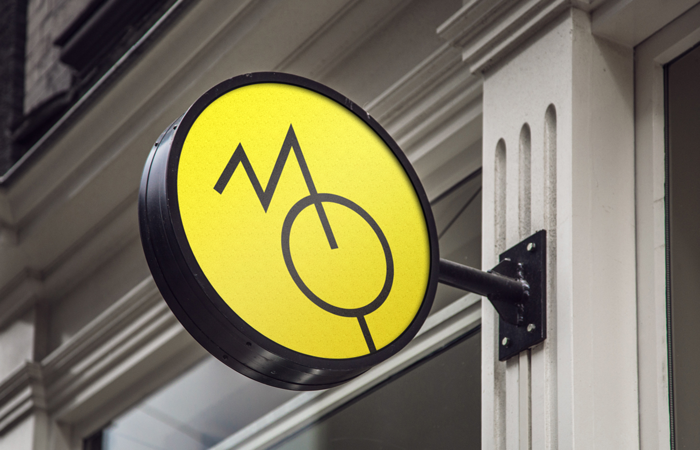
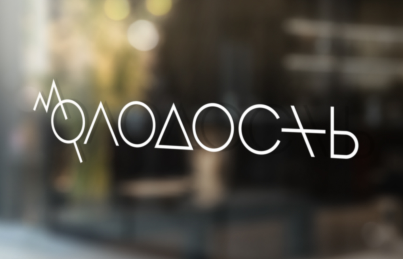
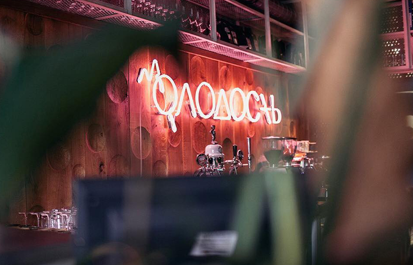
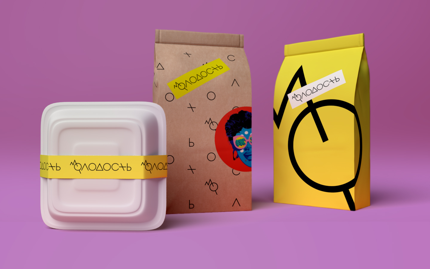
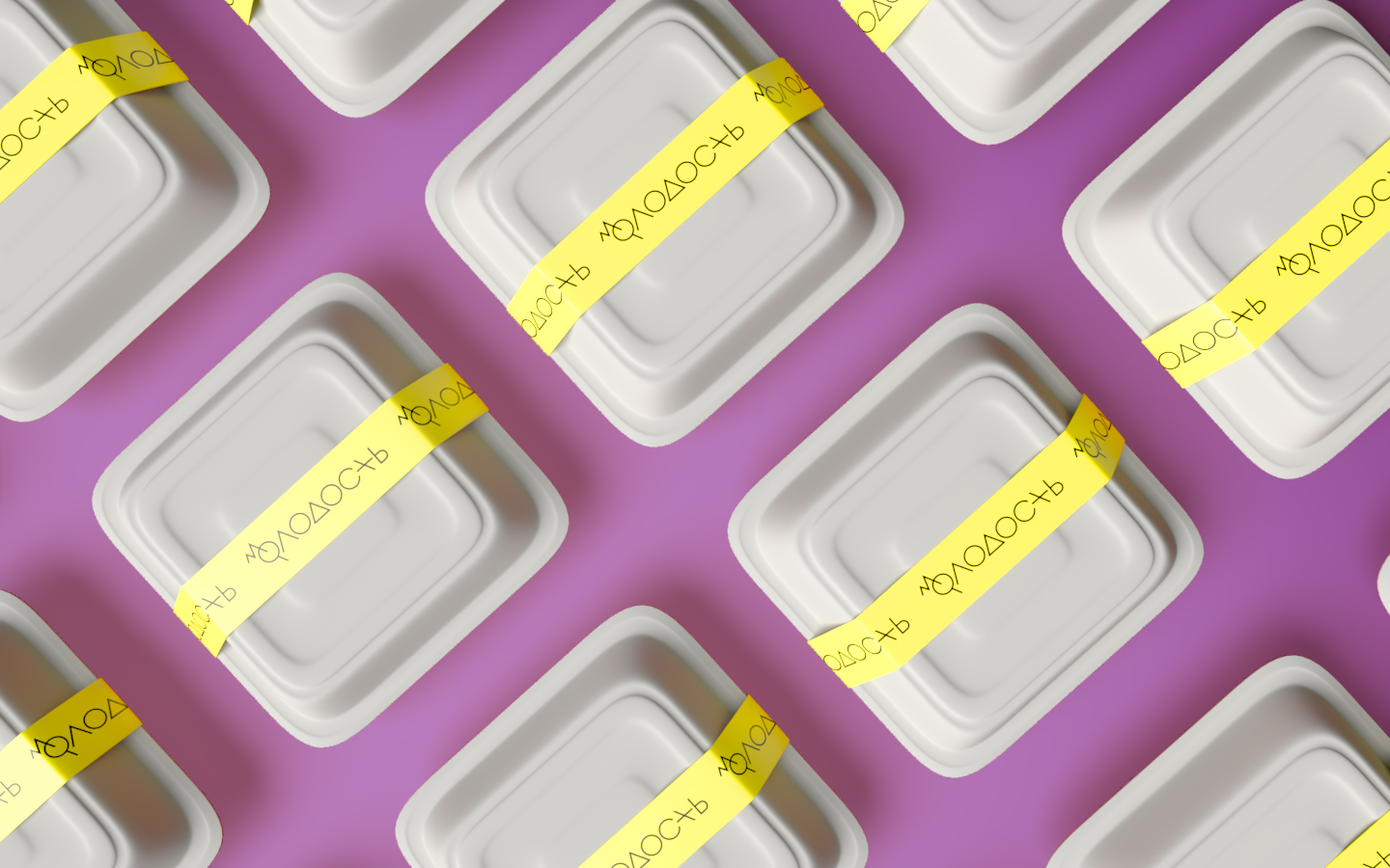
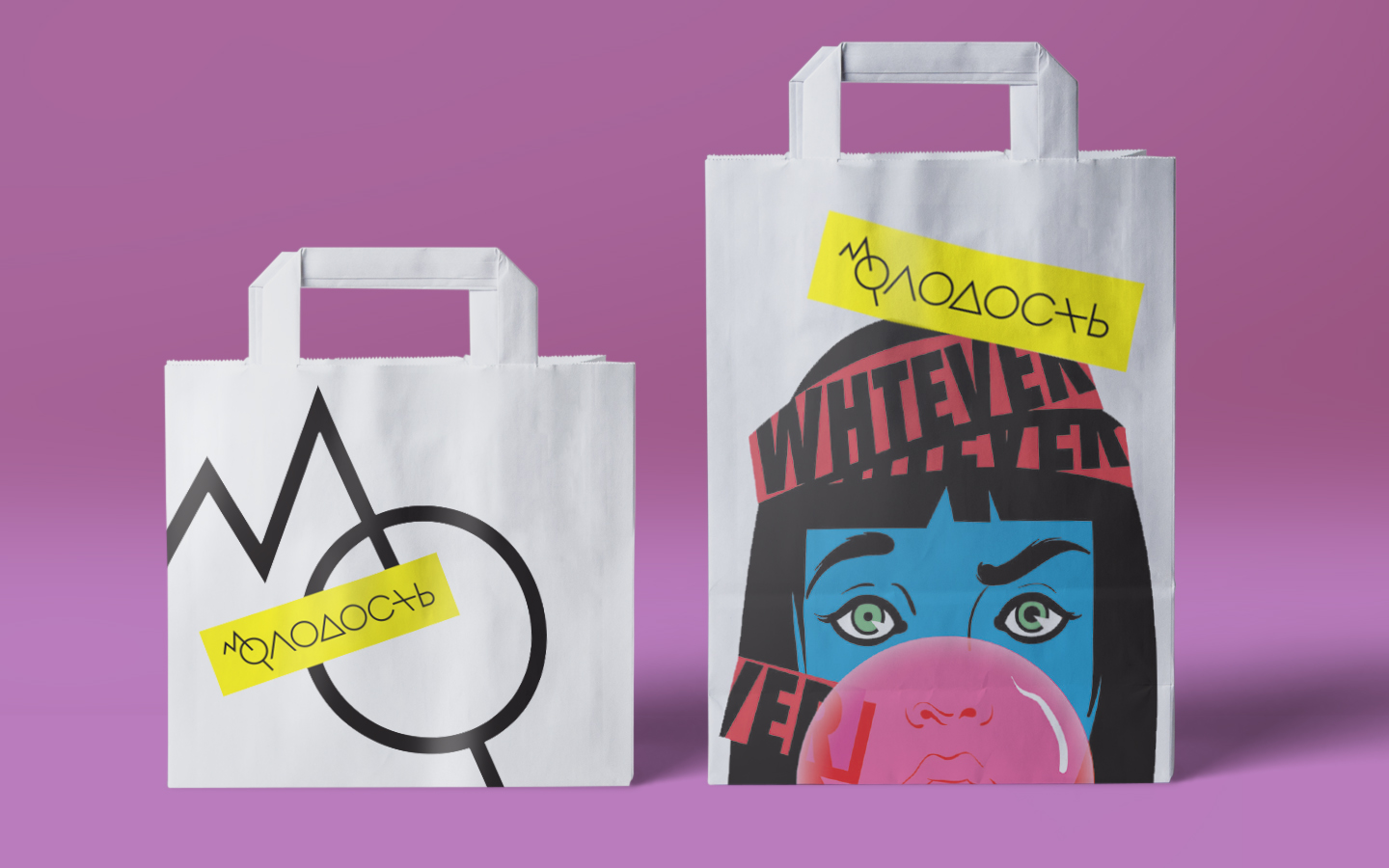
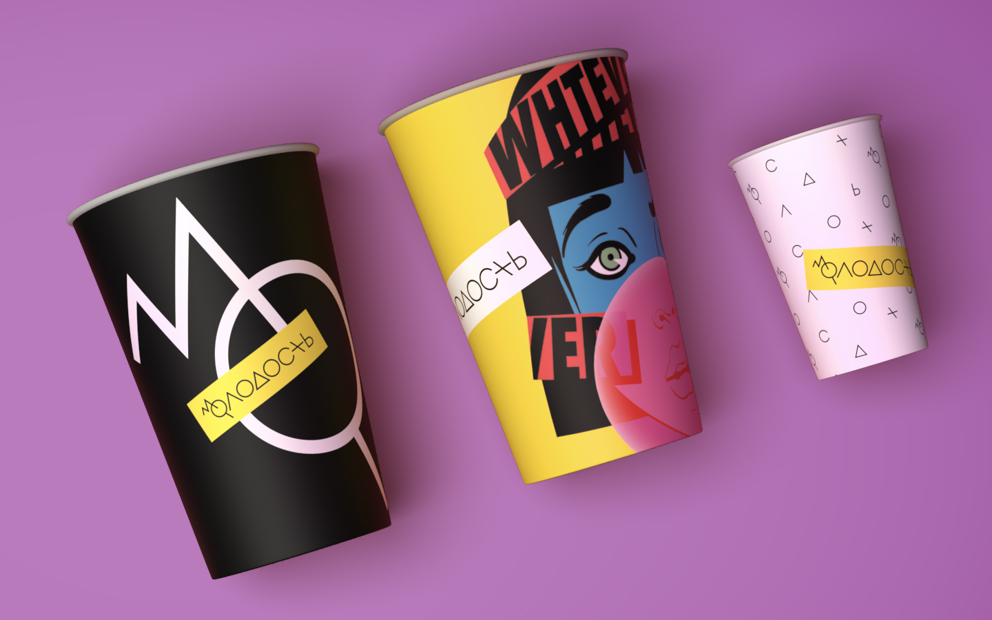
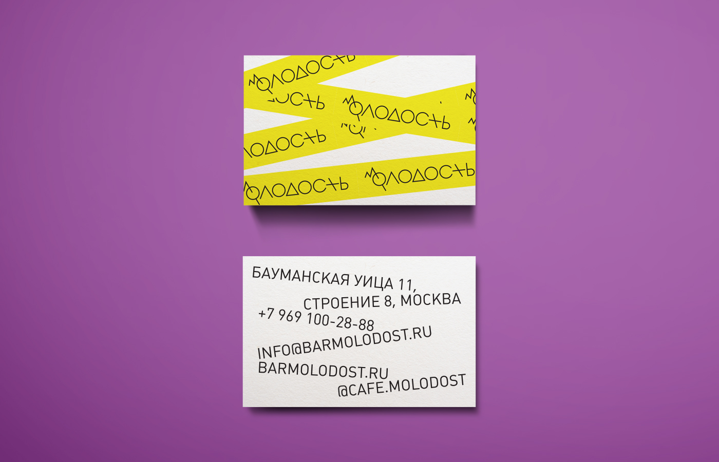
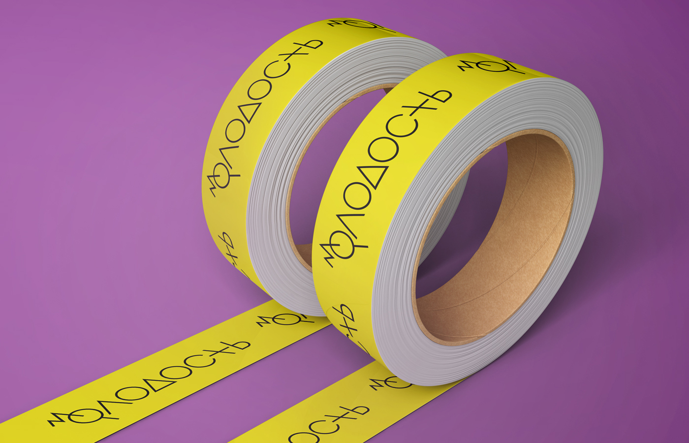
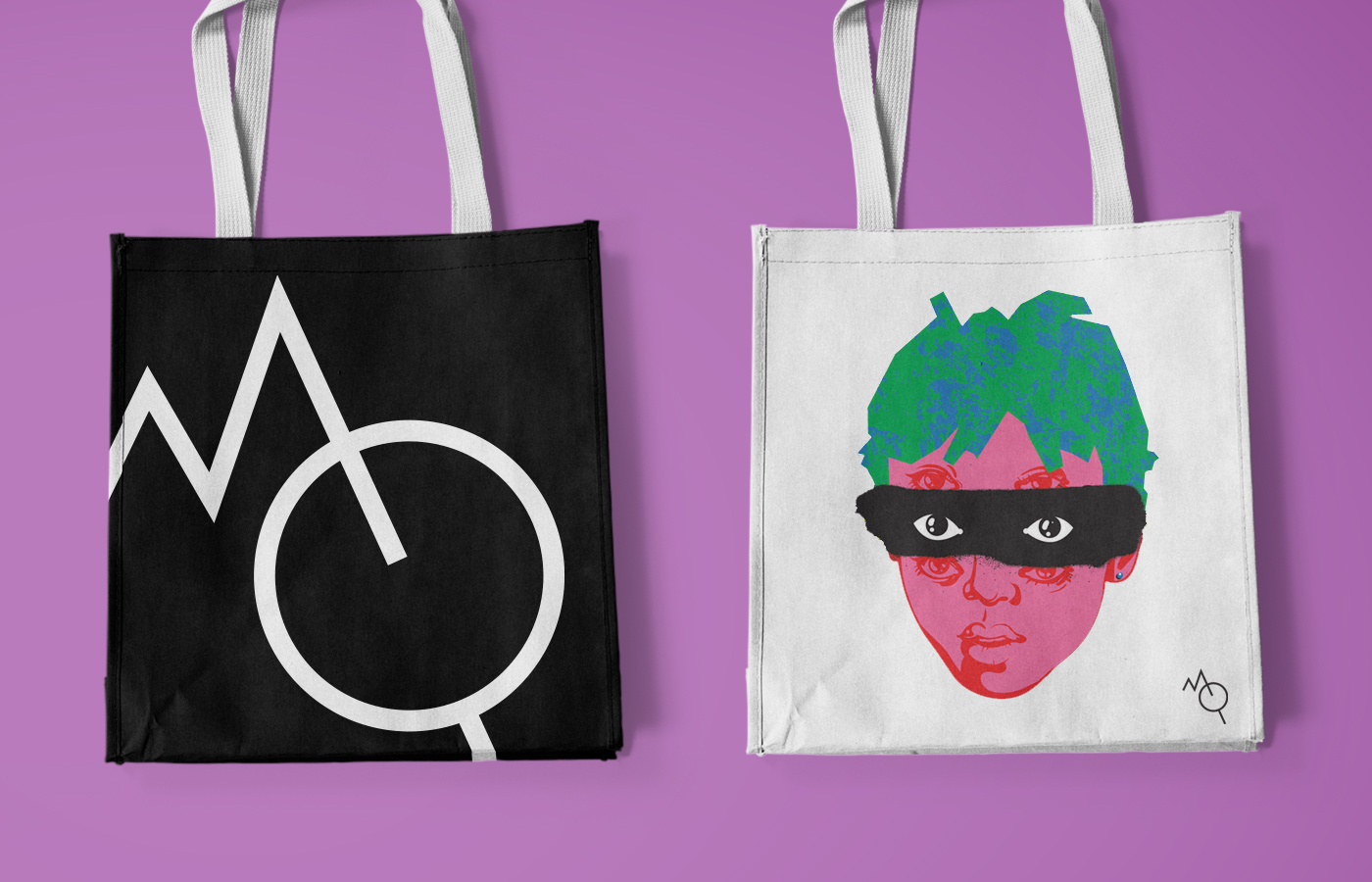
MOLODOST means YOUTH in Russian and so I designed a playful typographical identity reflecting the joyful, ruthless spirit of youth. The core element is a “yellow caution label” with a sharp dynamic logo to mark “a zone of youth” — marking an inclusive spacewalks of excitement.
The “MO” symbol conveing an idea of a piercing dynamic will to have fun. The bright identity is designed to work effectively in all media: signs, print and digital.
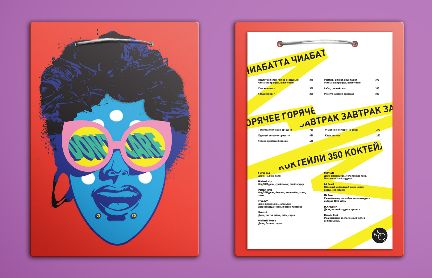
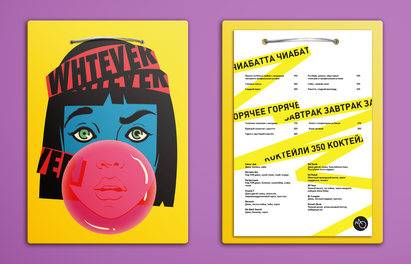
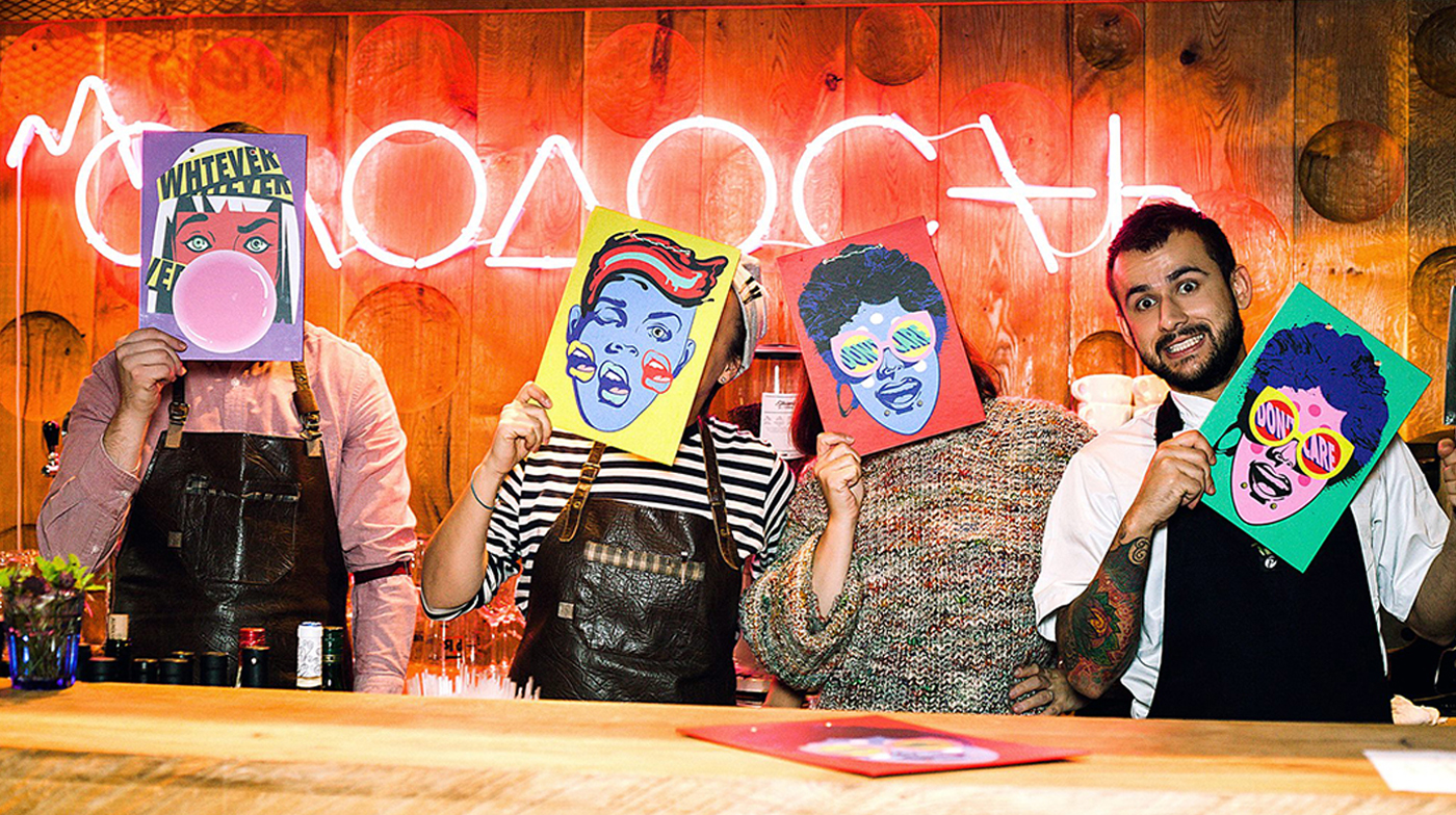
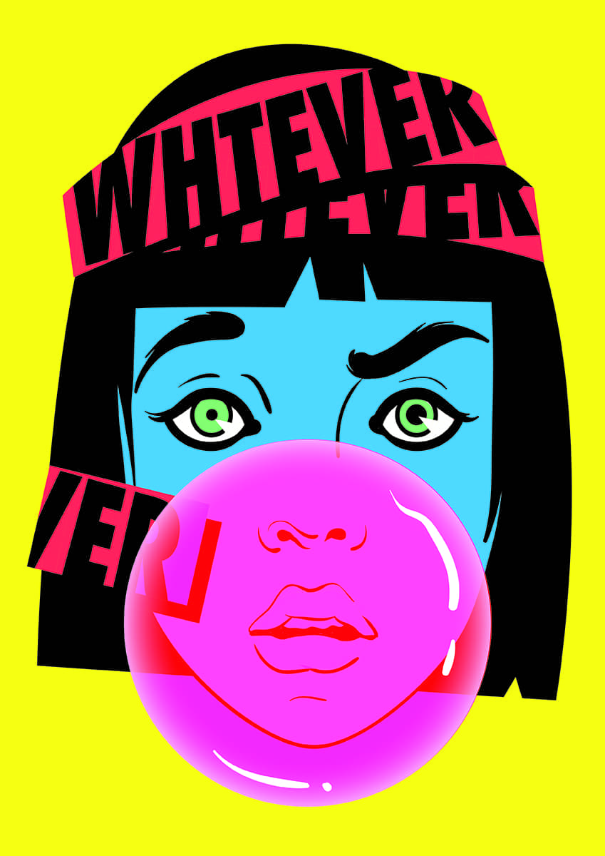
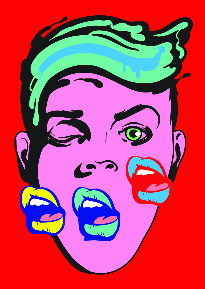
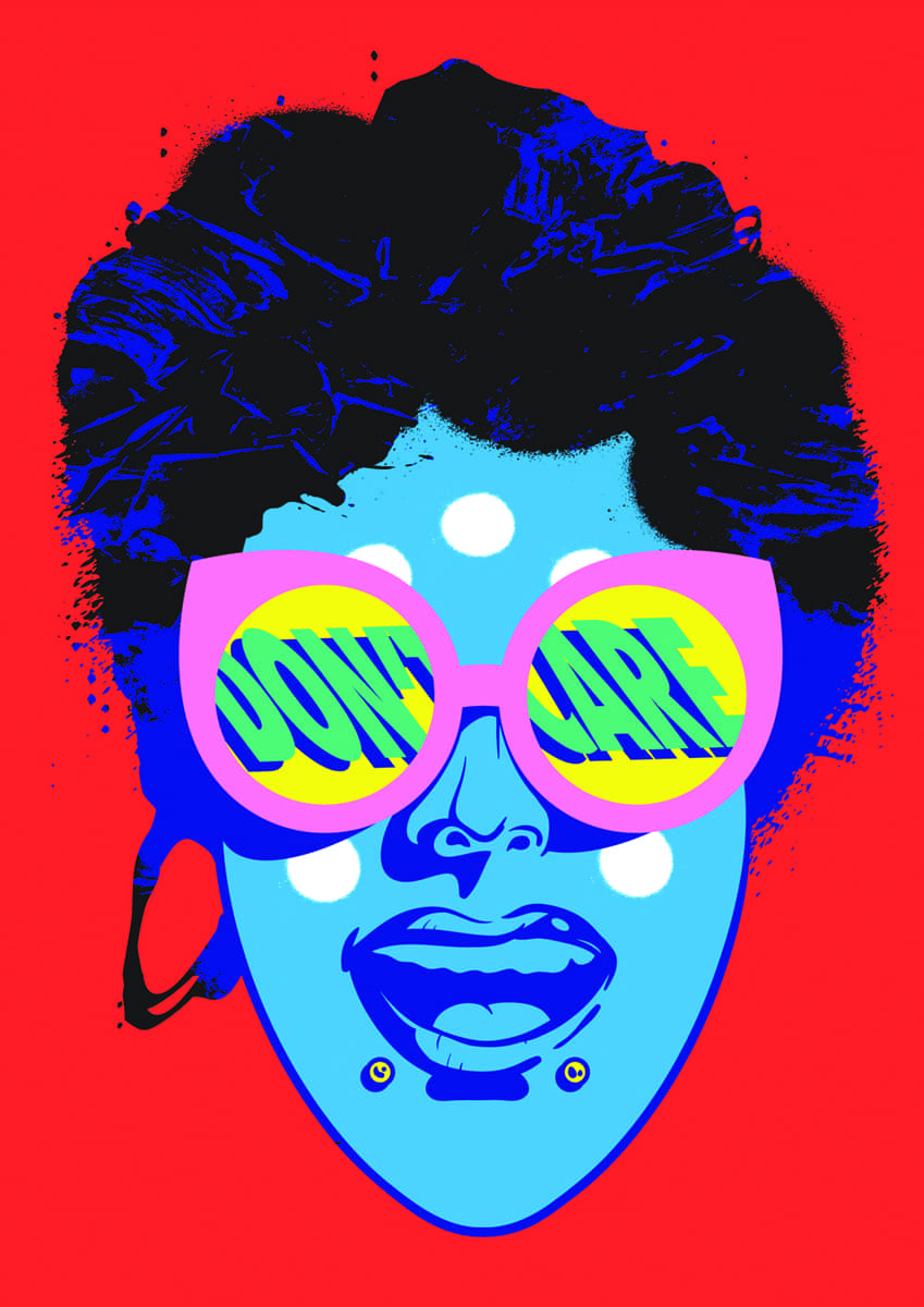
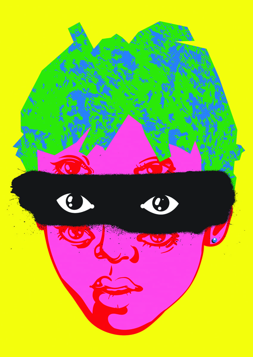
To support an idea of energetic brand, taking inspiration from pop-art, I also created a series of portraits of young faces as a vibrant part of the brand identity. These illustrations are used across different media printed on menu covers, merchandise, stickers, flyers, and other promotional materials. The fun and cheeky nature of the designs entertain customers and create curiosity about the venue.
THE RESULT
By establishing a voice and bringing the brand to life MOLODOST BAR was highly regarded by Moscow’s influential media, and, most importantly, gained a number of loyal locals that supported the bar during the pandemic, raising the flag of timeless youthfulness hight above, turning the brand into a lifestyle.